Churchill’s
Branding, packaging and integrated communications to create a premium wine brand
Churchill’s was founded in 1981 by Johnny Graham who wanted to perpetuate his family’s centuries long involvement in port while creating his own individual winemaking style.
We were asked to develop a premium brand positioning, visual identity and integrated communications to help Churchill’s stand up and be recognised for the excellence of its products.


Our bright thinking
• Vision and Values
• Qualitative research
• New brand strategy
• Internal workshops
• Strategic Consultancy
• Service design and alignment with brand
• Website design and build
• Print design
• Launch
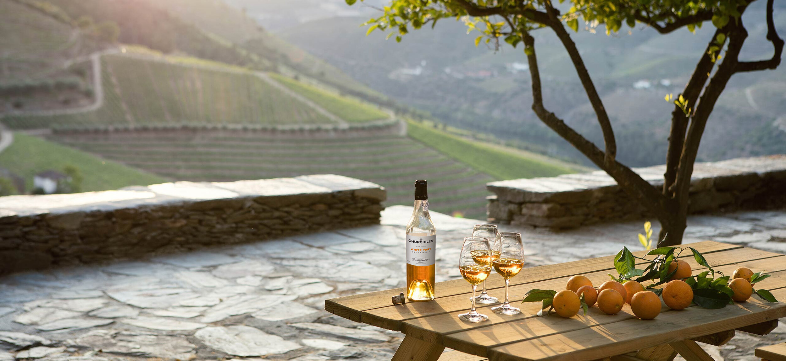
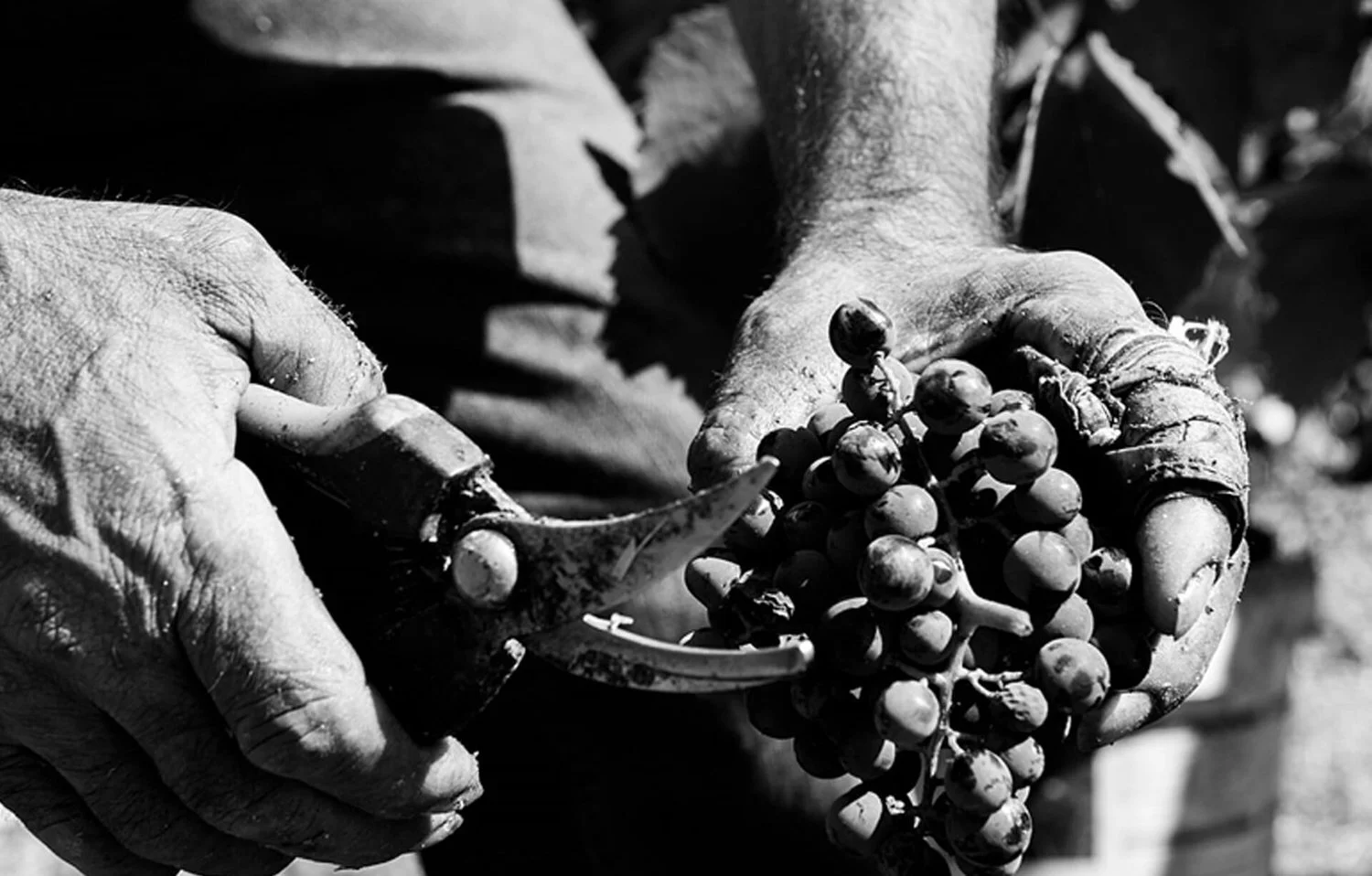
In terms of consumer perception, the world of port is all too often characterised by old established firms, candlelight and stilton, with a bottle or two at Christmas. After a detailed briefing from the client on their goals and aspirations for the business, a visit to the lodges in Oporto and vineyards in the Douro (along with some all important tutored tasting of the port range) what we found was hand crafted winemaking, beautiful landscapes and an unbending commitment to quality.
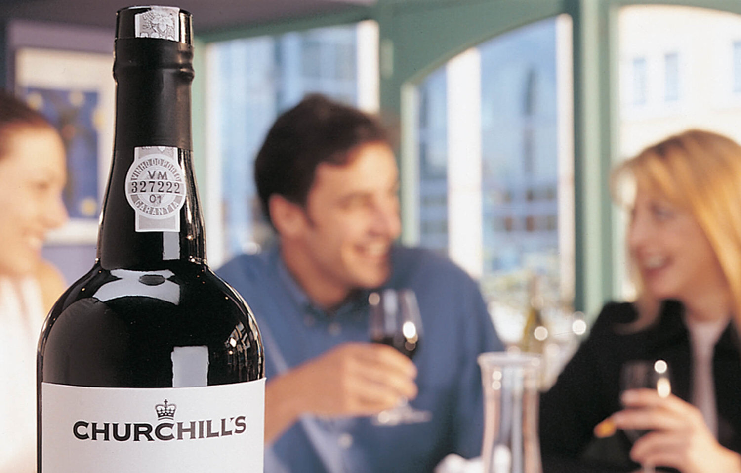
In brand terms port was a sleeper and we recognised an opportunity to bring port into the fresh air and connect with a new generation of wine lovers all over the world.

Our inspired creativity
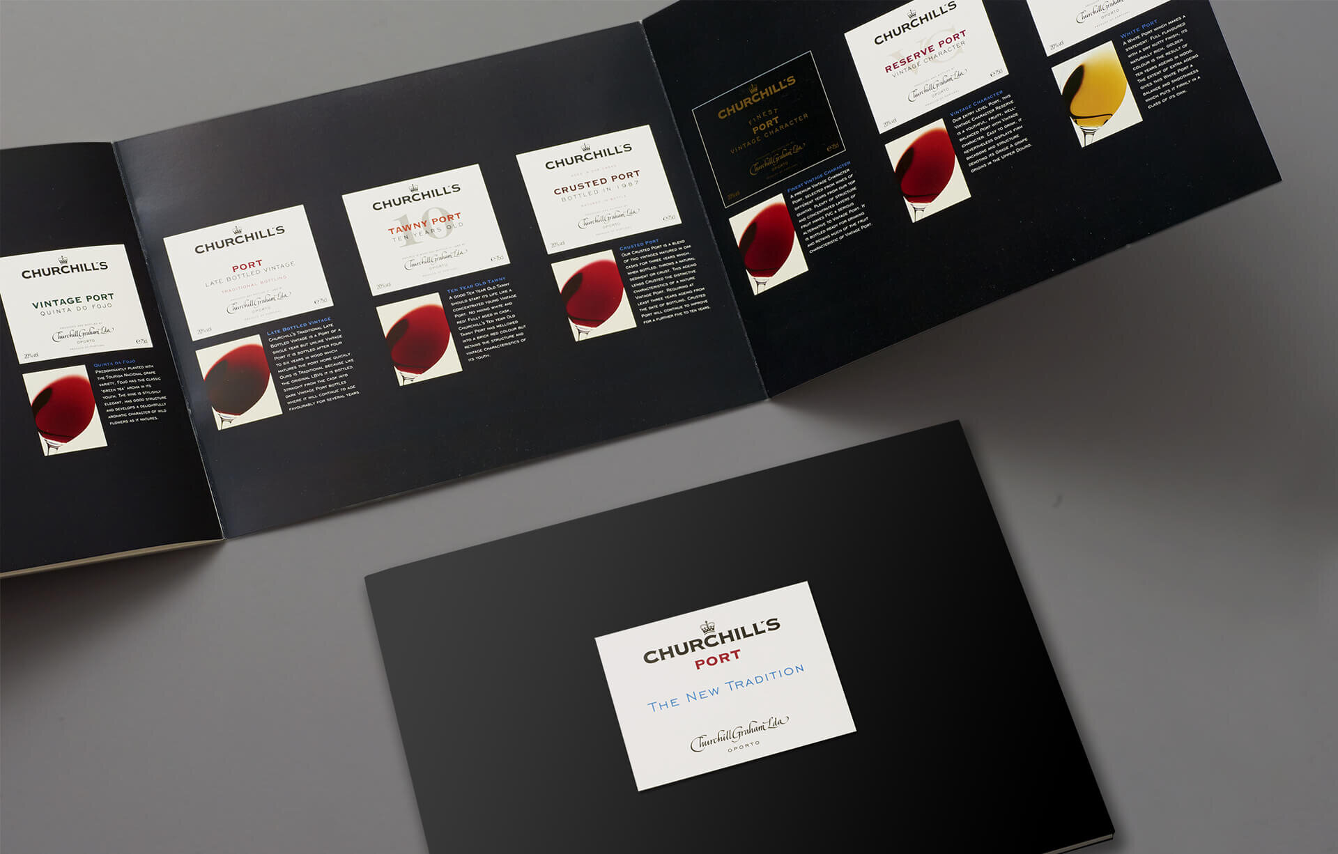
The processes and places were old, the company and people behind it young. We created a premium brand positioning around the idea of ‘The New Tradition’ balancing Churchill’s unique mix of old and new. We created a new visual identity that is at once bold, authoritative and yet clean and contemporary.
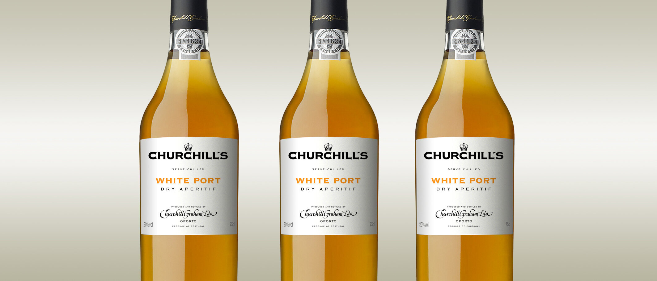
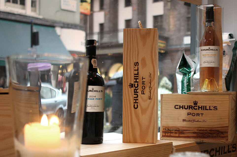
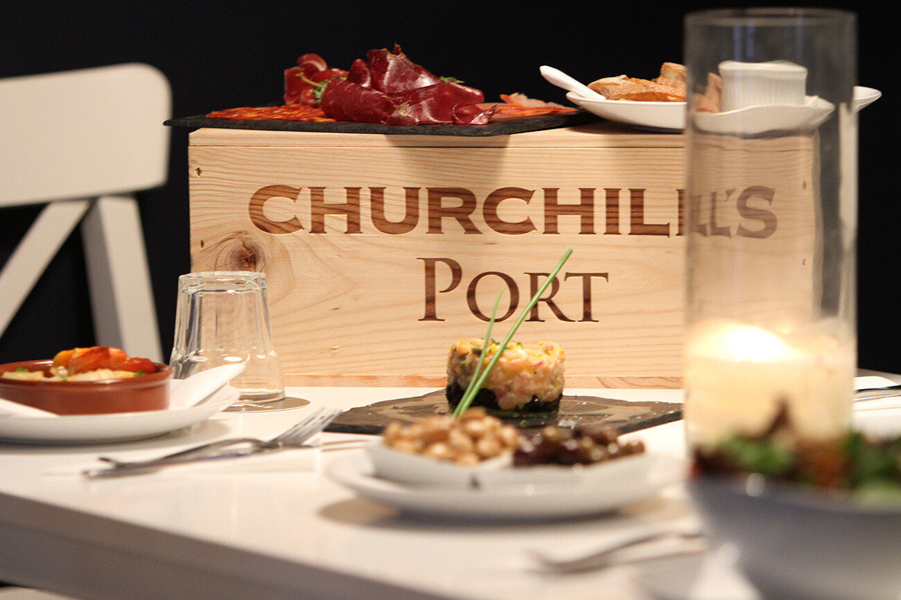
To communicate Johnny Graham’s fresh thinking, evolved styles and intense focus on terroir, we used words and imagery that tell the story of a hand made product and the landscape from which it comes. We designed label and capsule packaging for the range of ports which is classic, fresh and clean. The back labels tell the Churchill’s story in an engaging and captivating way. A premium look, tone and feel is expressed consistently across all consumer touchpoints including product literature, shelf talkers and wooden packing cases. A premium brand is born.
Seduced by the golden glow of Churchill’s White Port in the glass, Manifest pioneered bottling port in clear glass (since widely copied by others) and, following its launch at the London Wine Fair, sales by volume rose by over 2,000% in the following 12 months.