Faridoon
Creating a brand and designing packaging for a range of wine designed to complement Indian food
Karan Bilimoria founded Cobra Beer in 1989 and the curry house favourite has since been awarded 101 Gold and Grand Gold Medals.
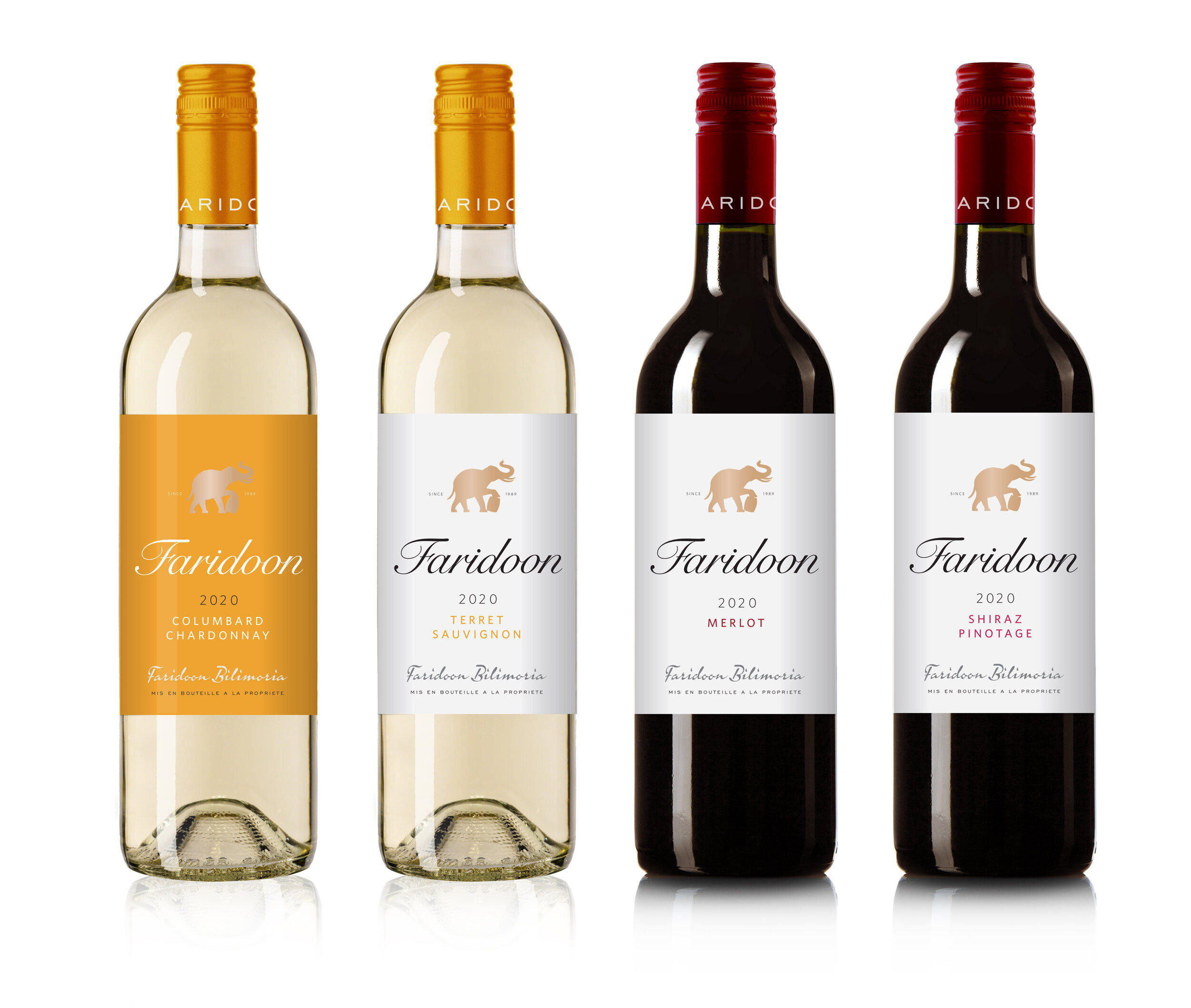
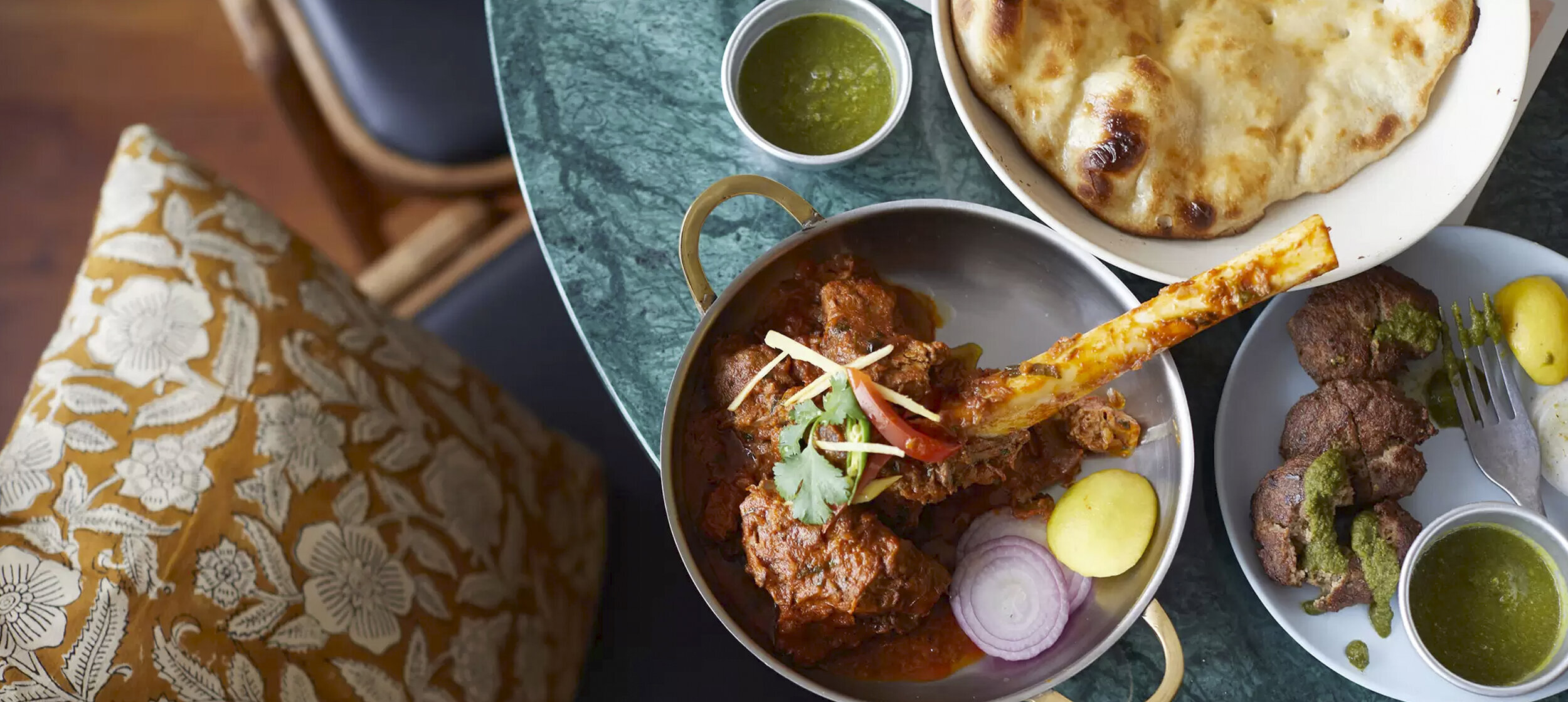
Recognising that many people prefer to drink wine with curry, Lord Bilimoria has asked us to develop a brand and create the packaging for a new range of red and white wines carefully selected to complement Indian food.
Our bright thinking
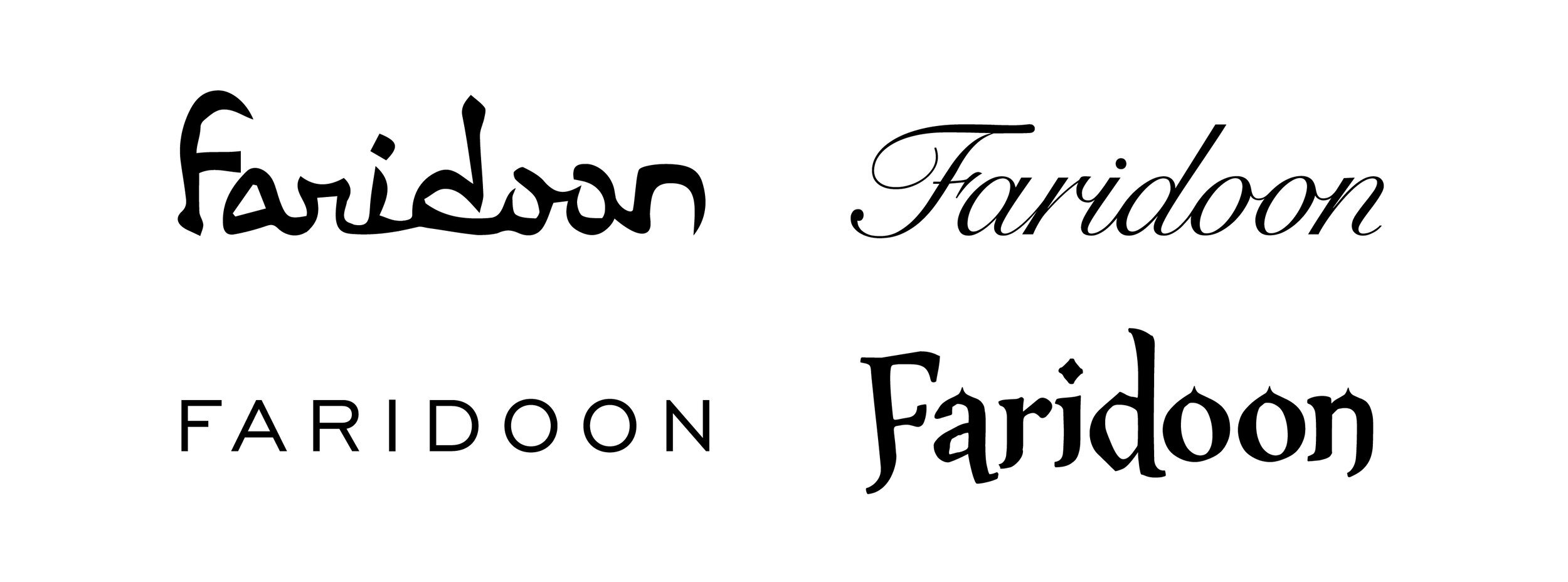
Our approach was informed by Lord Bilimoria’s strong sense of history and his family’s lineage as Zoroastrians and soldiers. He wanted to name the wines General Bilimoria to commemorate his late father. While respecting the sentiment, we proposed that the name needed to be simpler as well as more seductive and memorable. After a naming session we recommended Faridoon, General Bilimoria’s middle name which also links to Zoroastrian mythology and the family’s ancient origins in Persia. For French wines designed to complement Indian food, Faridoon also has a suitably international flavour.
Our inspired creativity
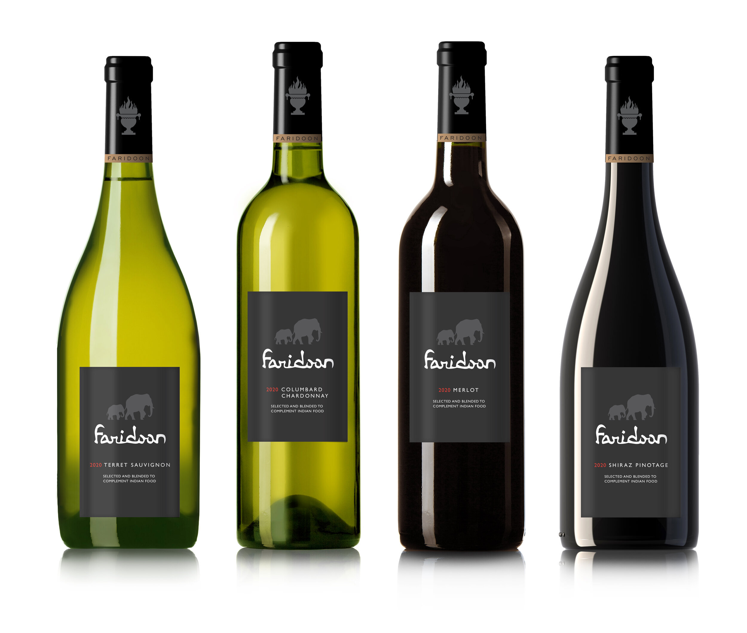
With a name we were able to start exploring logotypes which were distilled to four that stretched from traditional and historic to classic and contemporary.
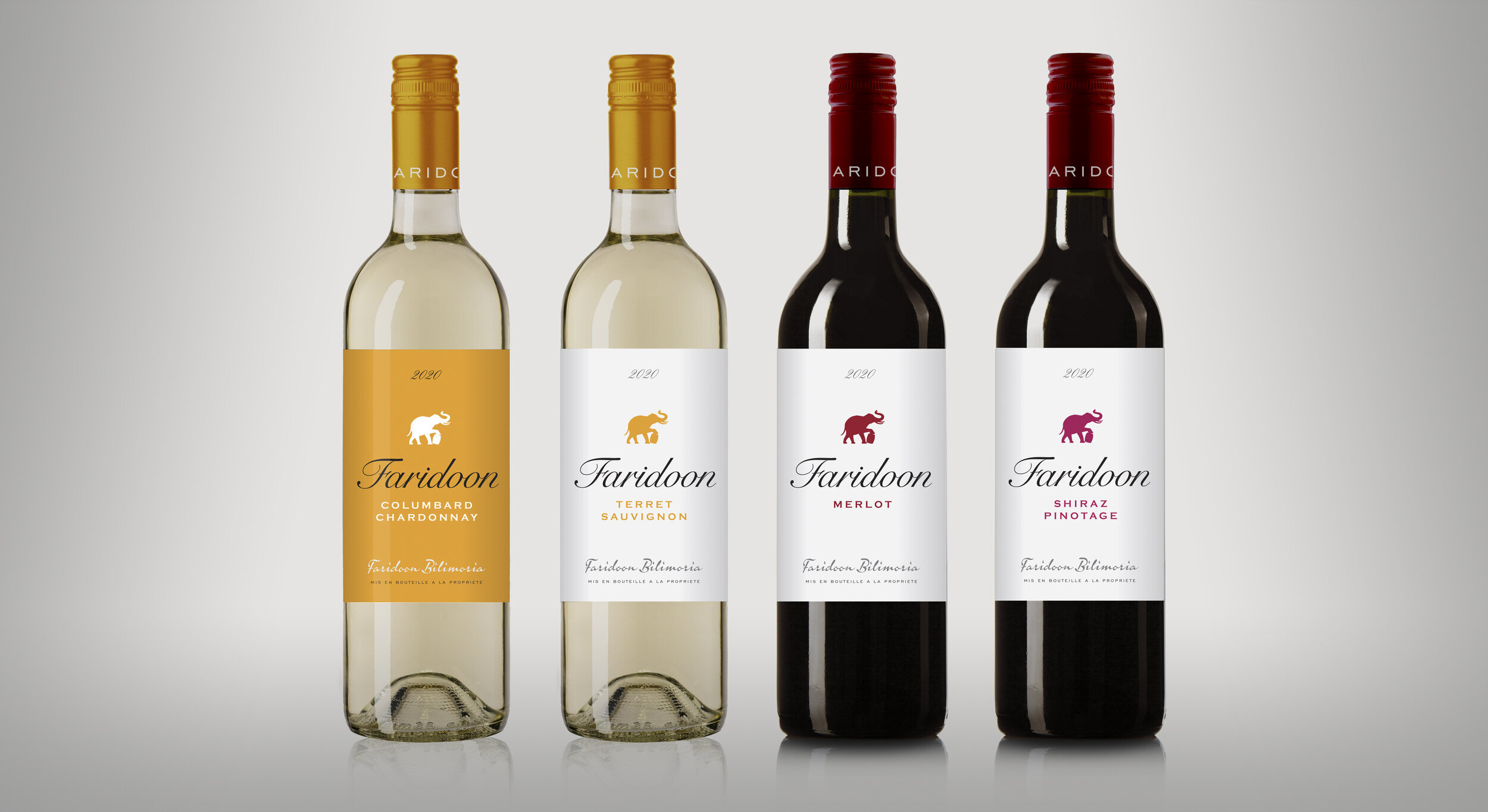
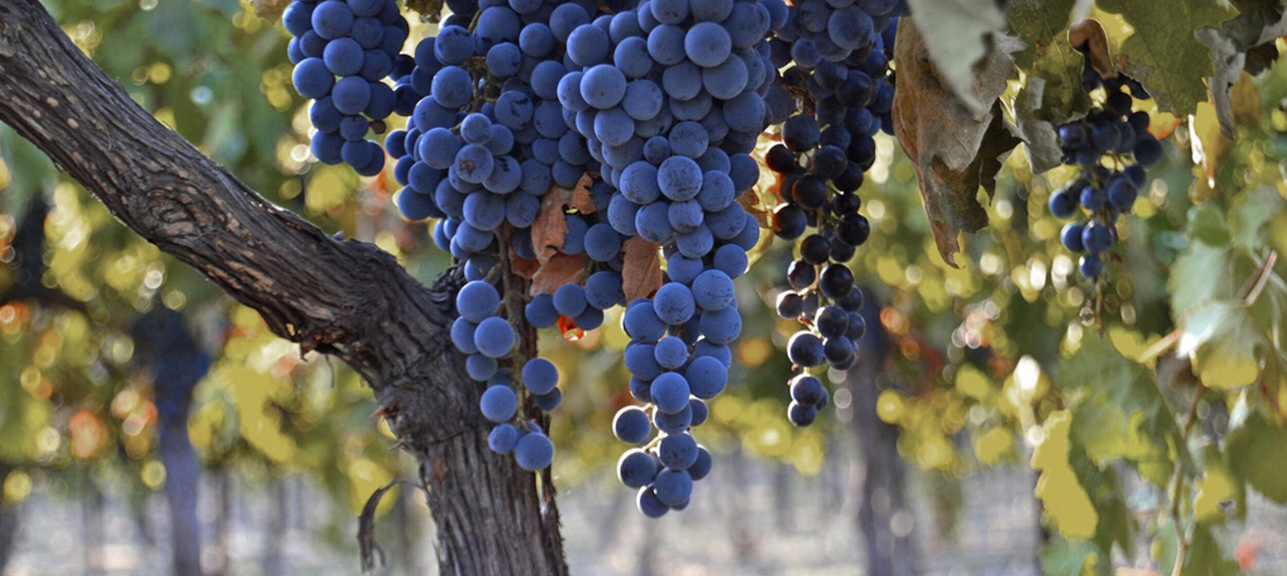
For the palette we took inspiration from Persian and Mughal paintings, natural pigment colours which we also found living in French vineyards and Lord Bilimoria’s coat of arms.
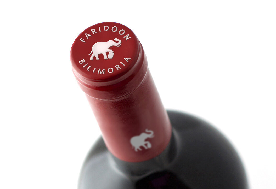
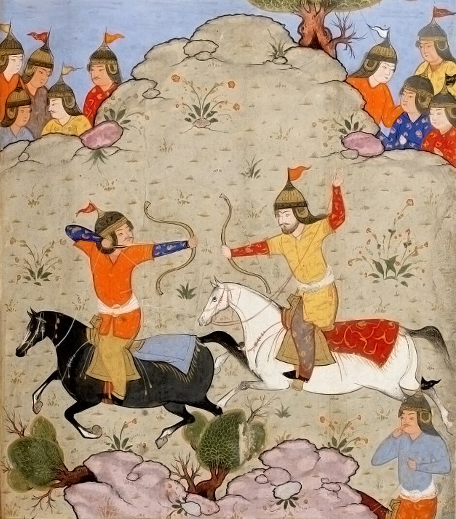
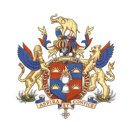
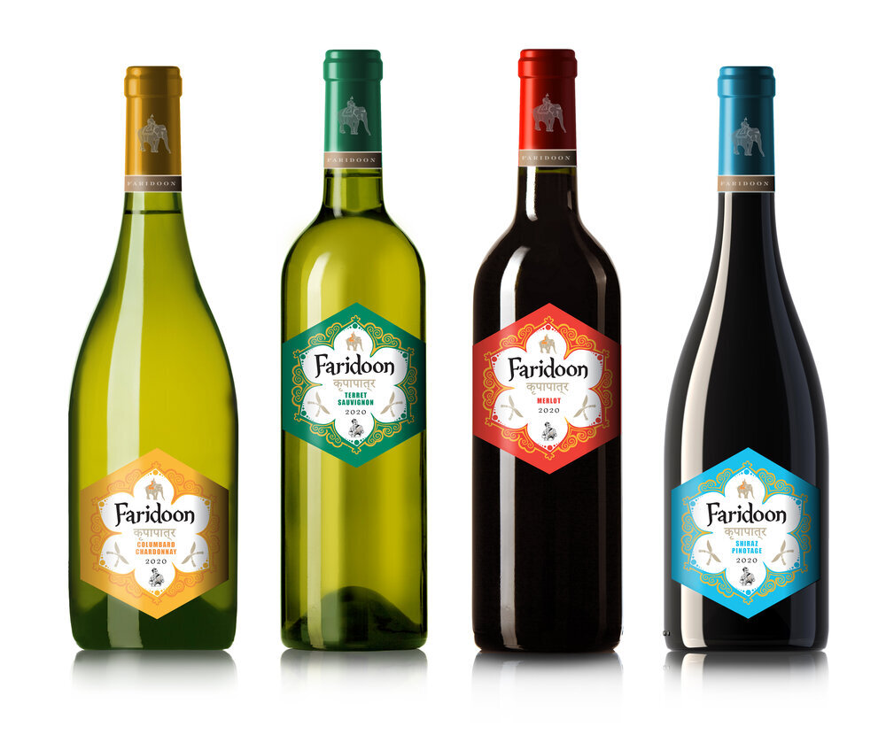
The creative exploration initially also drew inspiration from the Mughal painting, the coat of arms and Zoroastrian symbols. From the coat of arms we were struck by the elephant and barrel symbol (which works as a wine barrel as well as a beer cask) and this gradually developed into a shorthand mark for the brand.
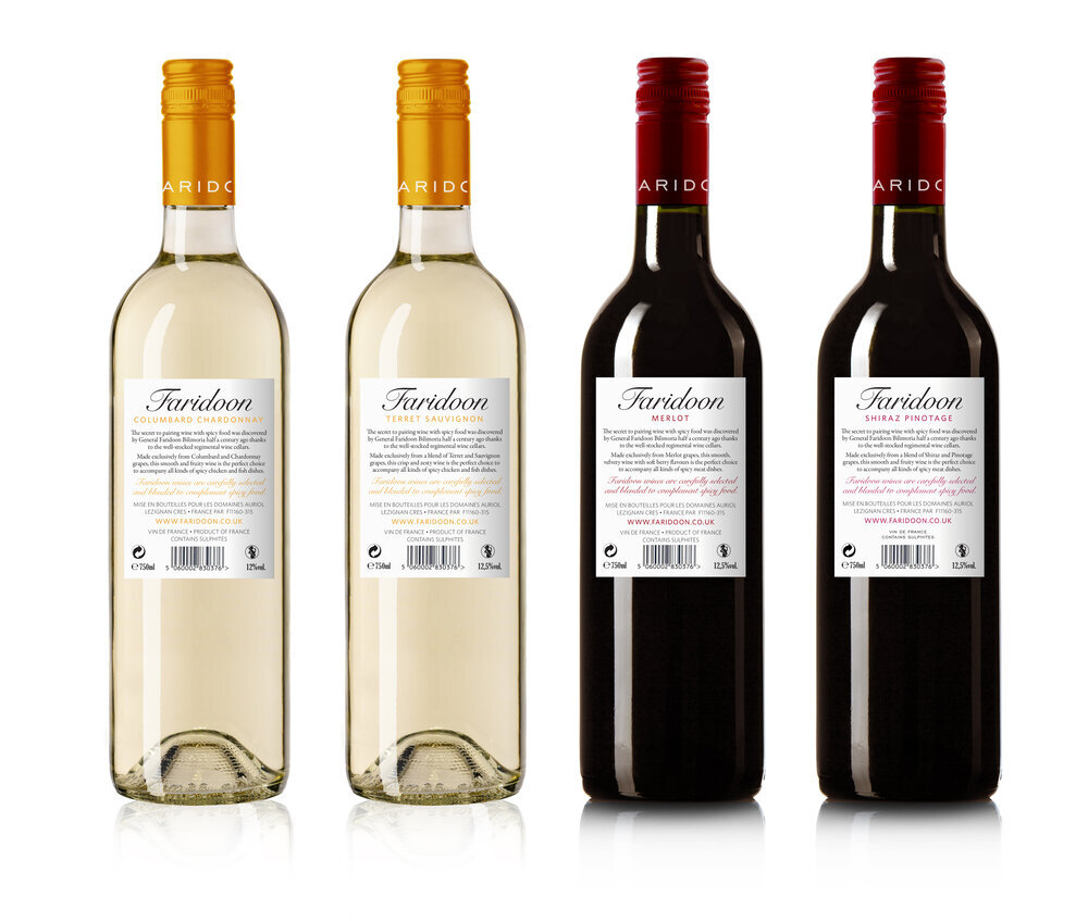
Taking the logotypes, colour palette, Zoroastrian symbols and Persian and Indian reference, we started to explore packaging routes for the wine range of two white and two red wines
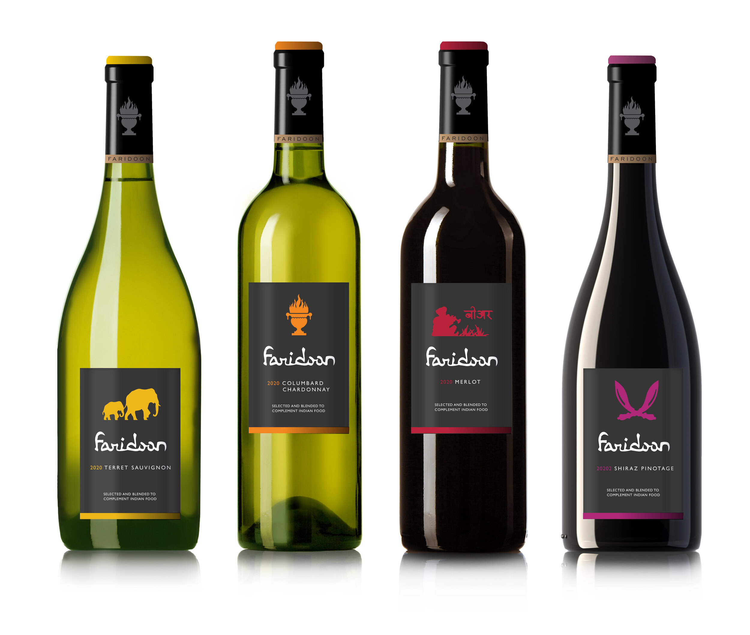
The use of Zoroastrian and Indian symbols led to a truly distinctive look. Our concern was that it was too limiting and created the impression of an Indian wine rather than wine chosen to pair with Indian food.
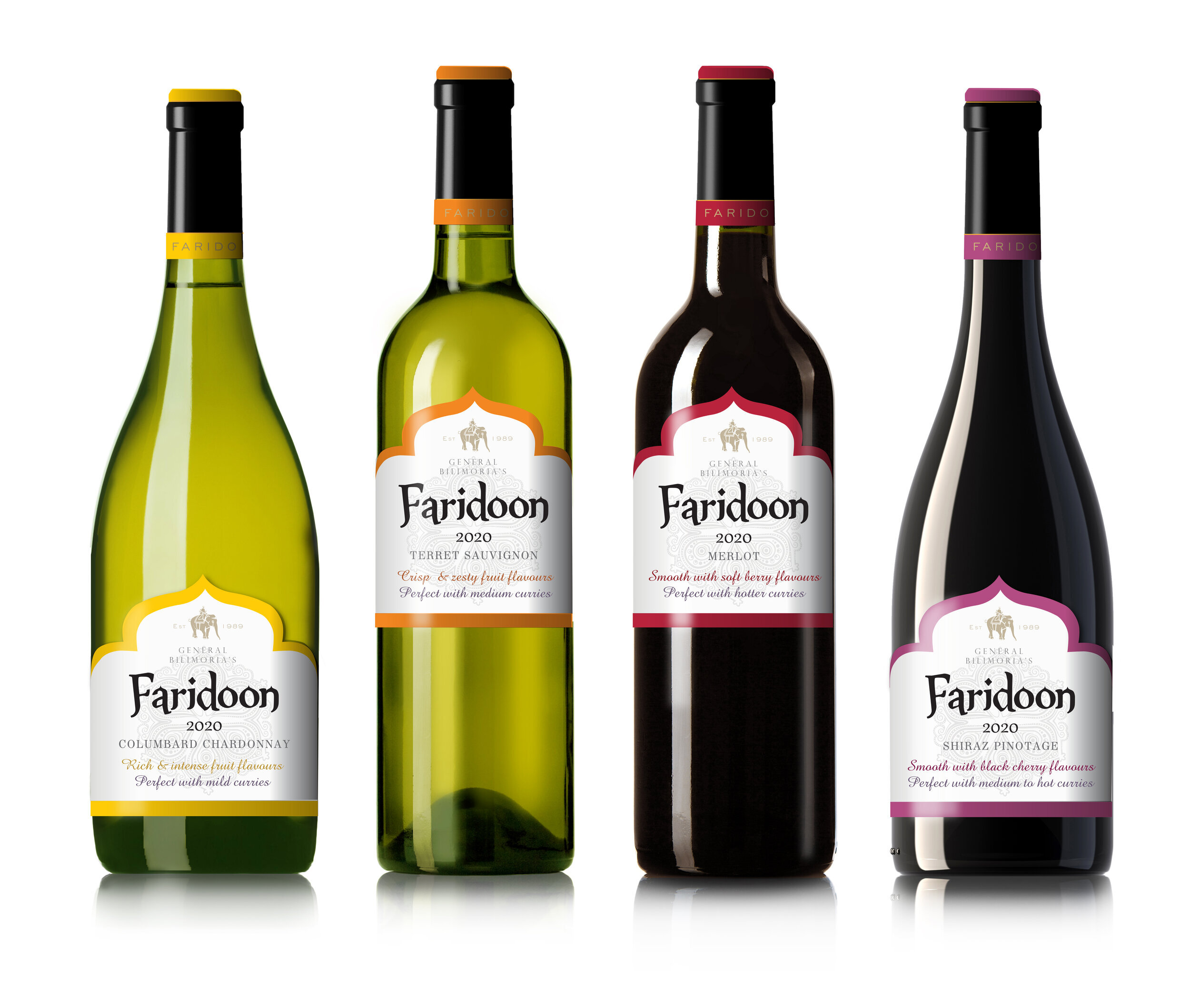
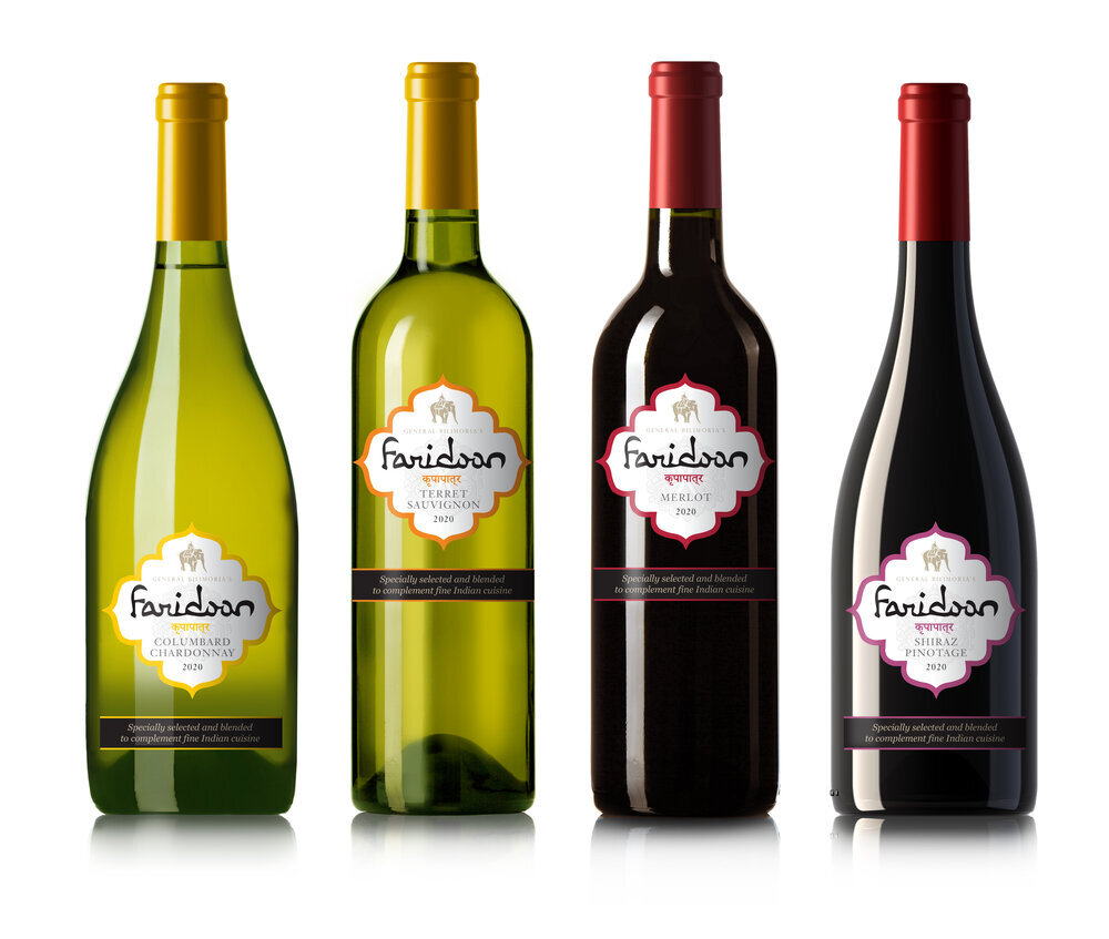
The chosen route is one that was the most refined form of the elements, striking a sophisticated balance by bringing the Bilimoria heritage and crest to the style a more classic French wine label. With a chosen route, final designs are in preparation and the client is finalising launch plans.