Ward & Co
Developing a brand and integrated marketing communications for a leader in historic building conservation
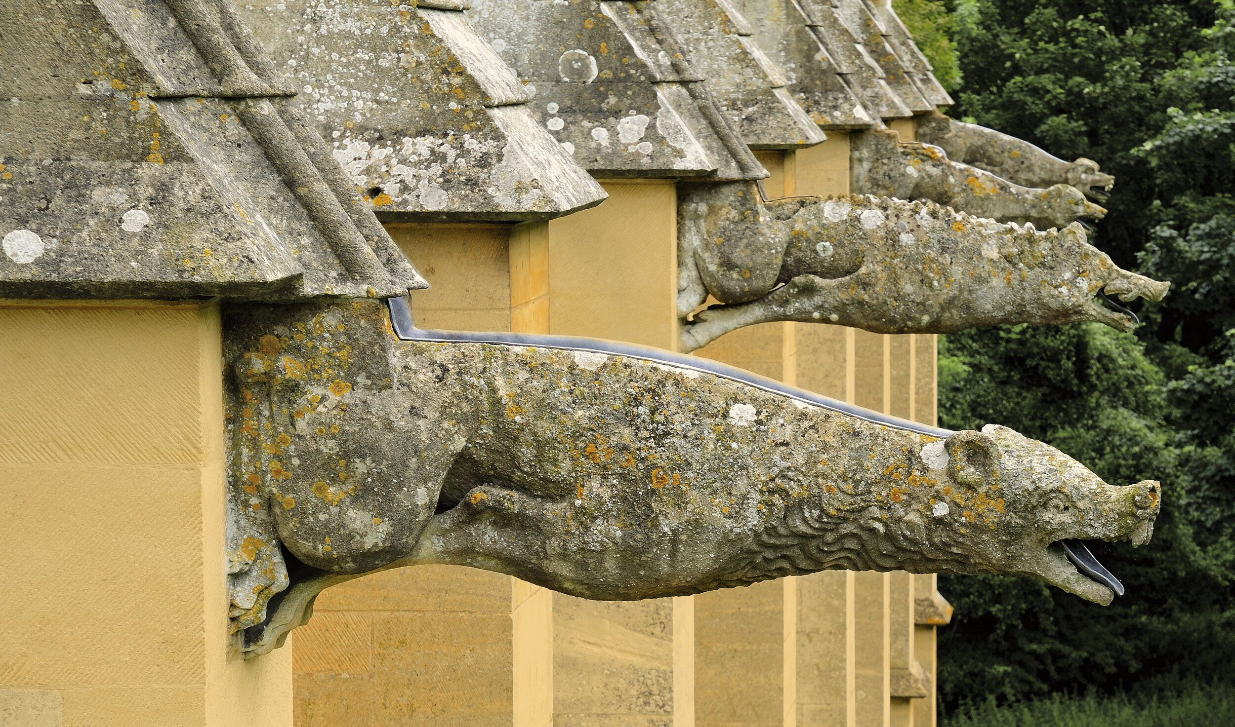
Ward & Co has grown from a niche historic buildings conservancy to become one of England’s leading contractors working with National Trust, English Heritage, Historic Royal Palaces to preserve England’s most important built heritage.
We were asked to evolve the Ward brand, create a new visual identity and integrated marketing communications to capture and articulate the reality of the company’s achievement, capabilities and aspirations.
Our bright thinking
• Vision and Values
• Qualitative research
• New brand strategy
• Internal workshops
• Strategic Consultancy
• Service design and alignment with brand
• Website design and build
• Print design
• Launch
England is blessed with a wealth of built heritage, the most important of which is managed by the National Trust, English Heritage and Historic Royal Palaces. To help them look after their properties, these bodies need historic building conservation contractors whom they can trust to work to the highest standards and provide good value for money.
After meeting the management team and touring the yards and workshops, what impressed us about the Ward & Co team can be summarised in one word; integrity. Everyone we met was passionate about historic building conservation and superbly skilled at what they do.
The firm had been so intent on the quality of its work that the brand and marketing communications had become fragmented. The visual identity lacked polish and clarity and the messaging was spasmodic and inconsistent.
Our inspired creativity
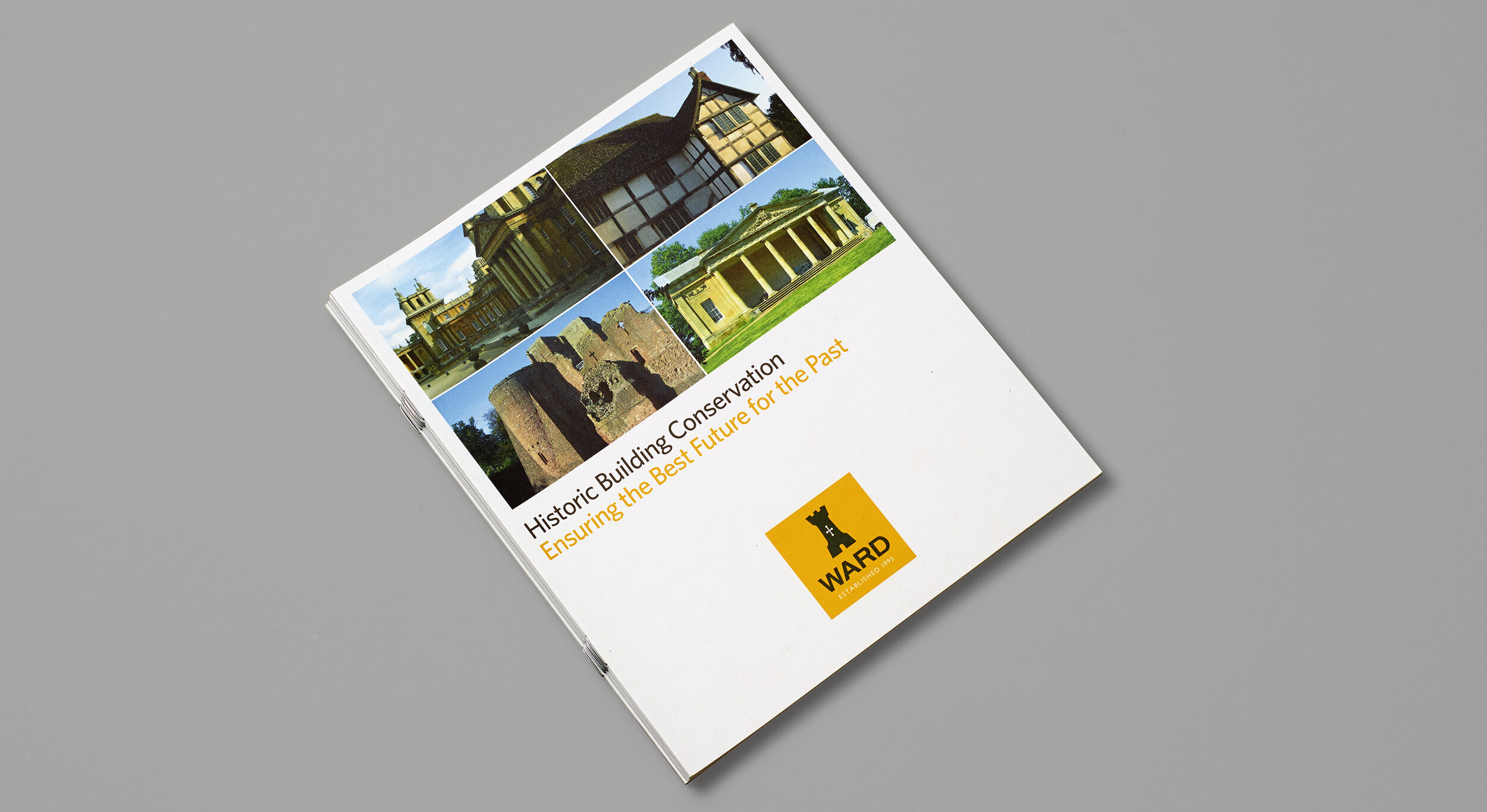
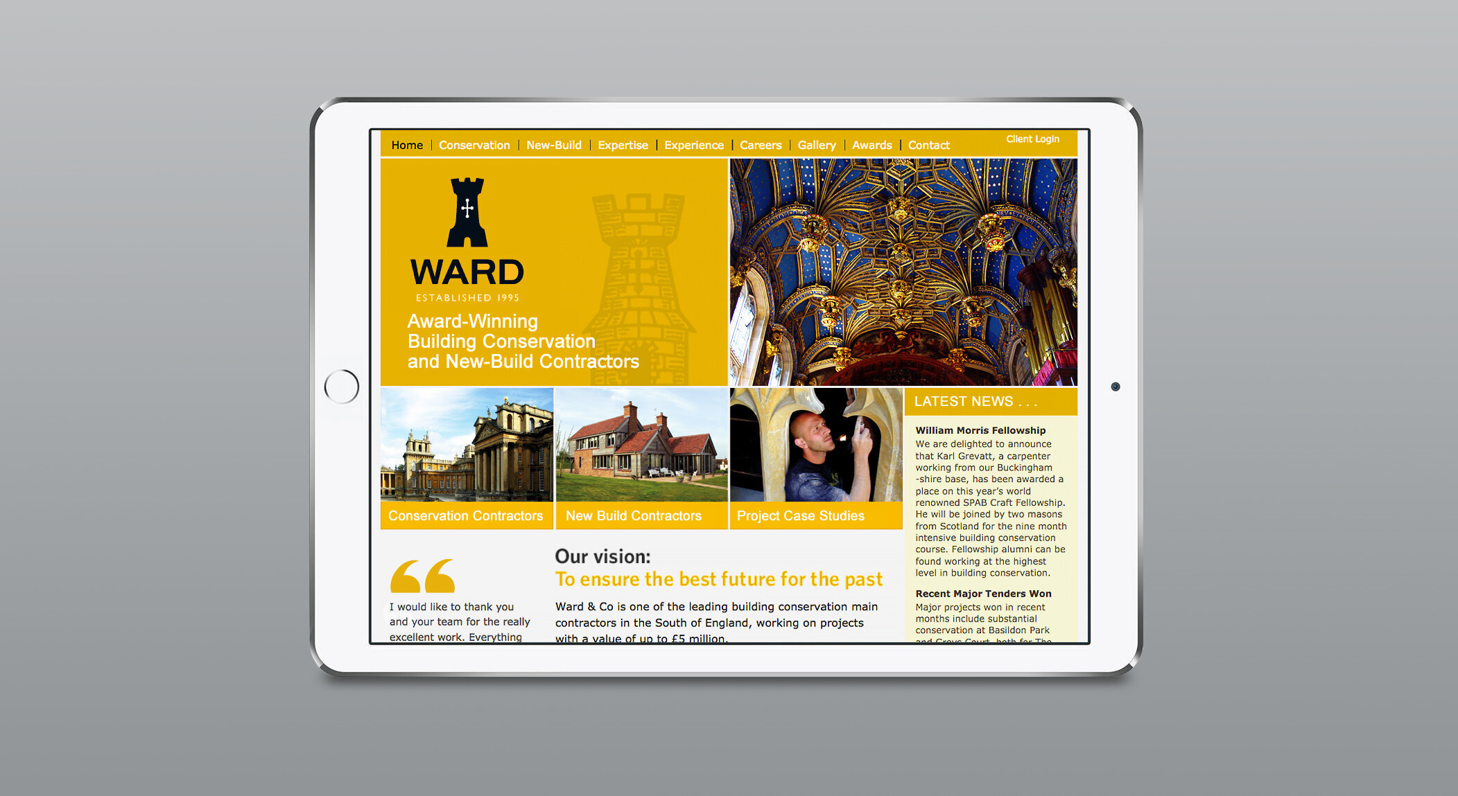
We felt that the ‘& Co’ in the name had an old fashioned charm but lacked a sense of purpose. We recommended that ‘Ward’ alone was simpler, bolder and stronger. Our research had identified that ‘ward’ meant a guardian or protector which also informed our recommendation. The castle symbol was chosen to express a united combination of qualities; the company as a guardian of built heritage, its dependable strength and integrity, and as an historic building relevant to the context of the company’s work.
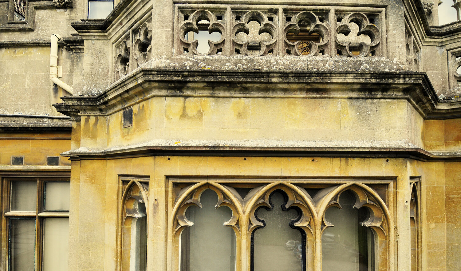
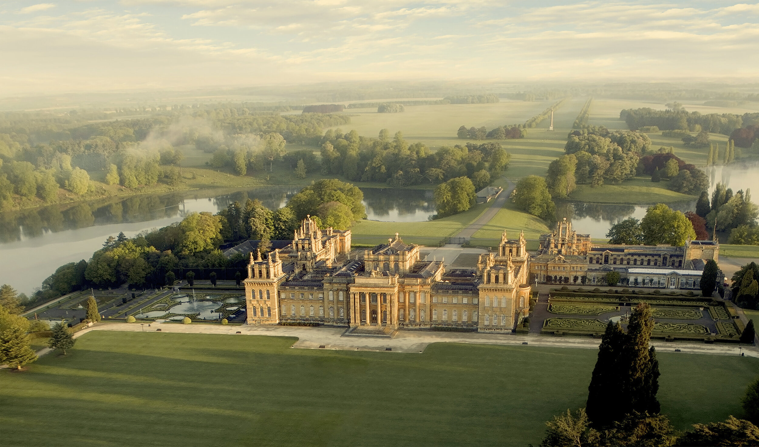
We designed a simple, recognisable castle mark and a clean and classic logotype, combining to form a strongly memorable identity. The bright, rich shade of yellow we used was inspired by colour of the stone and limewash we found in so many of Ward’s projects such as Blenheim.
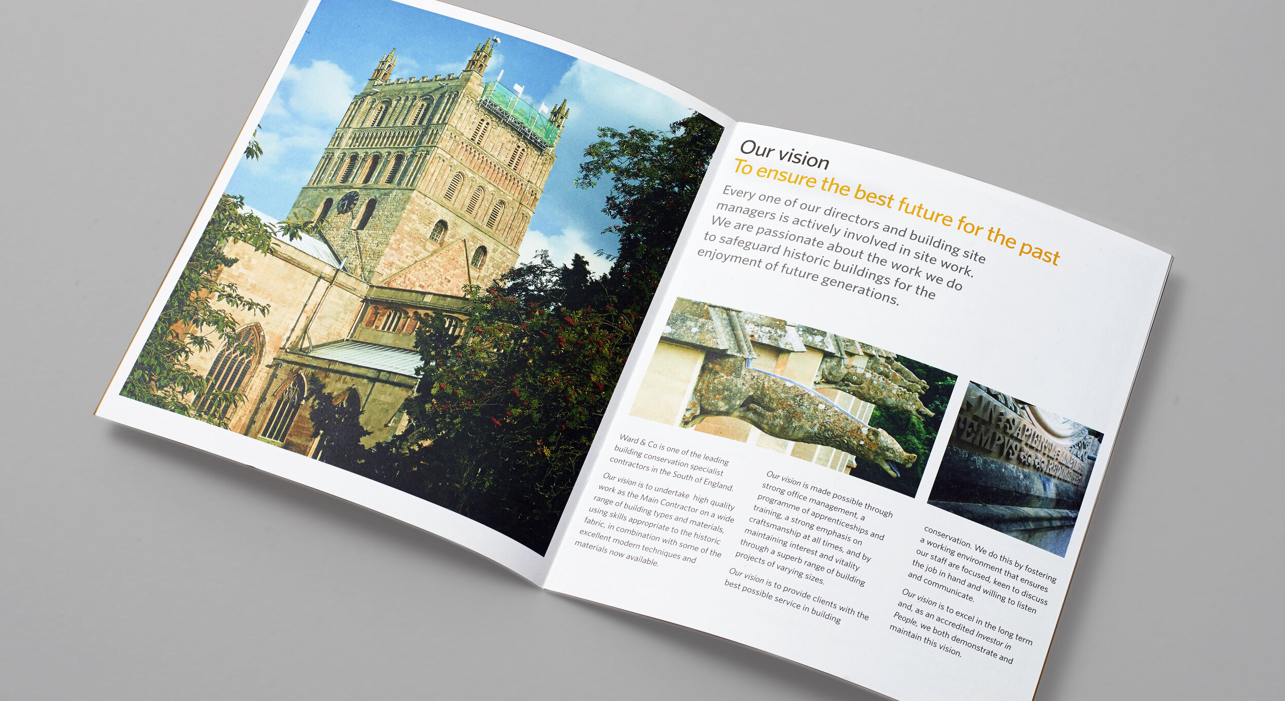
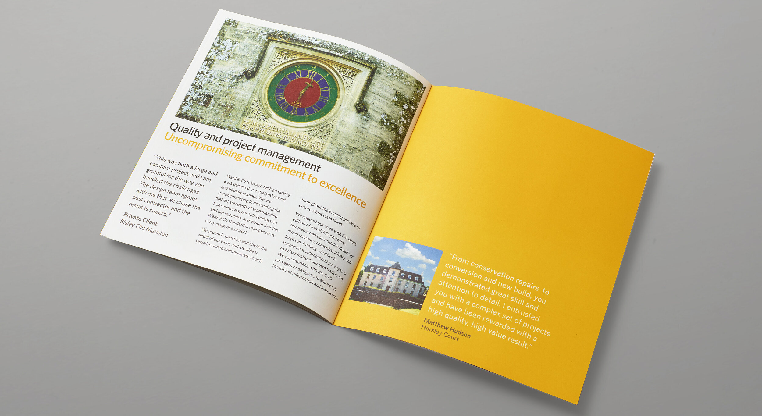
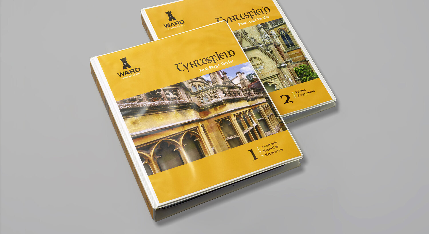
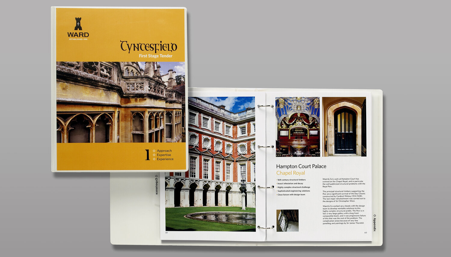
Using the brand positioning and visual identity, we developed a look and content strategy for the integrated marketing communications including the design and copywriting of a corporate brochure, website, stationery, advertisements and a digital template for preparing and presenting major project bids.